

The choice of colors and decoration
It is in function of the house’s orientation. Once the analysis done and the map established. Rooms by rooms, we will search the way to improve the quality of the energies coming into the house. Theres is several way to proceed, I better must say, several levels.
There is a very simple method, beter says much more simplistic running on the net since a lot of time and saying you: You take the front door, you cut your house into 9 equal boxes and after that you place red in the South, blue in the North, green in the East and so on. It will work!
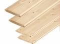 Roughly it comes to say: you buy 8 boards and one nails box, after that you build
one marquetry furniture. You who is “handyman”, I see you smiling to this idea. You know the time spending to create something that you know nothing previously. You can learn everything and
after, you must experiment and catch the hability to become efficient.
Roughly it comes to say: you buy 8 boards and one nails box, after that you build
one marquetry furniture. You who is “handyman”, I see you smiling to this idea. You know the time spending to create something that you know nothing previously. You can learn everything and
after, you must experiment and catch the hability to become efficient.
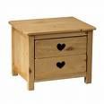 So once the boards are in place, you can probably do a
small furniture, but worthy of a big sweden shop with the respect for this mark but not worthy of the traditionnal hability.
So once the boards are in place, you can probably do a
small furniture, but worthy of a big sweden shop with the respect for this mark but not worthy of the traditionnal hability. 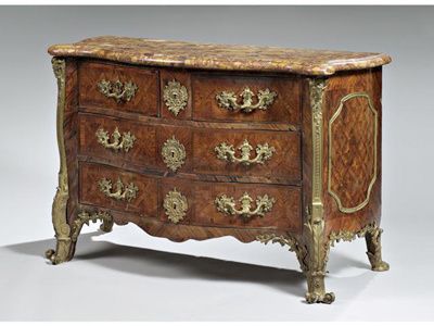
Comes back to the idea, we will help the energies coming inside the home by welcoming them. It is like to choose the best way to come to Paris instead of taking an amazing turn. There is some
energies that we desire to reduce, so we choose the good colors to soften the effects. These energies are called stars, this is just a technical word: it is obvious that the star is not coming at
thome. This is the flow of energy that she drain.
For the entry a neutral color: vanilla color (neutral) with a point of red (Fire) to calm down a negatif effect.
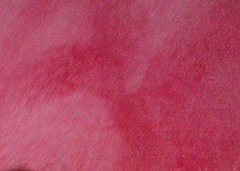
In the first room, flax (neutral) and raspberry (Feu)
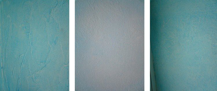
In the second room, light parma (neutral) and jade green (Water)
In the third room, a range of
turquoise (Water)
The floor is raw, the ceiling is white to give the more light as possible.
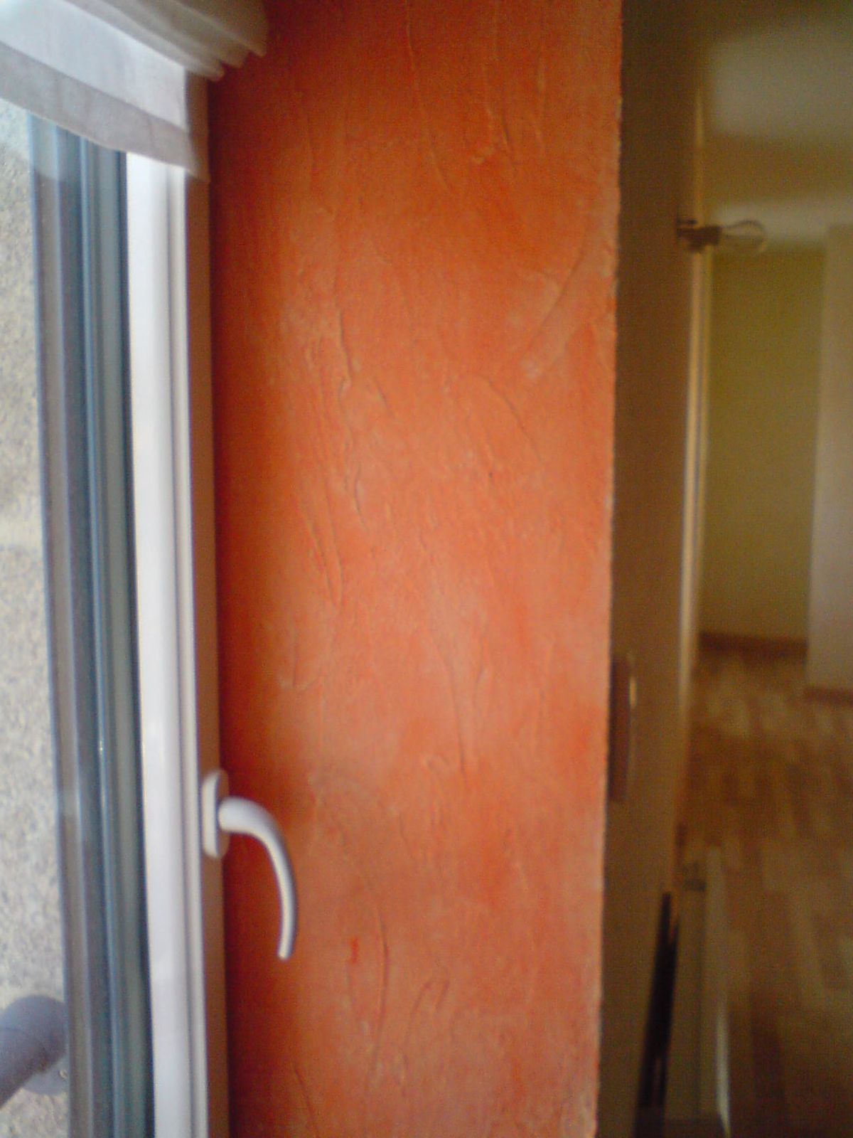
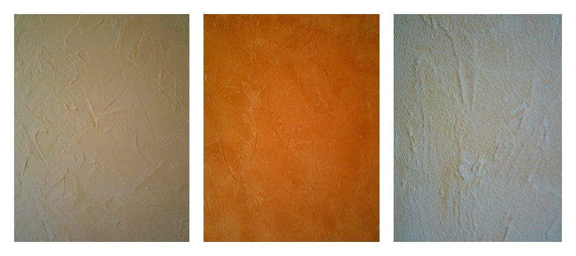
In the great room: on facing, vanilla as base on the walls and then a range of color coming from orange(Fire) to mandarine (Fire more soft) to yellow (Earth)
On the back wall a big poster
representing the sea (Water) and on each part a deer color (Earth)
The floor is light parquet and the ceiling white.
The colors posed, the effect is very nice.
To be continue…..


